Google Data Studio vs Klipfolio
![]()
![]()
We have published a new comparison between Data Studio and Klipfolio. Go check it out.
Why Klipfolio is 10 times better than Google Data Studio
As a data and dashboard company we have built and deployed countless Klipfolio dashboards in the last 5 years. We currently manage over 750 Klipfolio dashboards for about 200 clients. After the introduction of Google Data Studio in 2016 we expected demand to change from Klipfolio (a paid solution) to Data Studio (fee to use), but this has been only very limited. Here’s a genuine Google Data Studio vs. Klipfolio comparison.
The reason is simple: Free comes at a price. Depending on your needs you can choose your preferred dashboard tool, but in the end Klipfolio has (as it should) a lot more to offer. Based on our experience with both Data Studio and Klipfolio, we can give some advice on which tool to choose. If you are looking for a quick and dirty way to show some key metrics (likely coming from a from a google sheet) in a good but not really fancy looking dashboard, Data Studio is a decent choice (as is Klipfolio by the way).
But if you are looking for a more professional looking and more advanced dashboard, Klipfolio is definitely the better option. And that’s not an easy thing to achieve. After all, Google has a multi billion budget to invest.
3 stages of building a dashboard
When working with a dashboard platform, there are basically 3 stages you are going through:
- Getting data in your dashboard
- Visualizing your dashboard
- Creating scale with your dashboards
Below we will give you 10 reasons why our clients keep using Klipfolio and did not make the switch to Data Studio.
Getting data in
1. Ways to connect your data – Non-google data connections
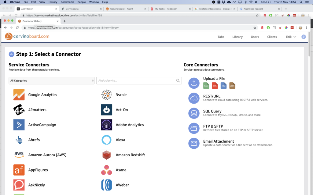
Klipfolio offers over 400 native integrations with other platforms (including our Cervinodata integration https://www.cervinodata.com ) to get data in. Data Studio only has 18. Although the Data Studio does offer a Data Studio community connector with 138 partner connectors, many of those connectors are for the same channel (there are 18 Facebook Ads connectors).
And even if the number of connectors grows in Data Studio, it is still so much easier to get data into Klipfolio. In particular the core connectors, see the screenshot below, offer a variety of very easy ways to get your data in.
Klipfolio core connector & service connector page
2. Data blending
Both Data Studio and Klipfolio give the option to merge multiple data sources to one datafile. But Klipfolio offers more ways to combine data, because you can also combine multiple data sources in one graph or table or combine data sources with advanced formulas. Klipfolio is more flexible that way in daily use.
And if you need to blend many data sources into one data file (like all the analytics views for your 20 + international websites) it is always better to pre-process the data before putting it in a reporting or dashboard tool. Tools like Supermetrics (https://www.supermetrics.com) or Cervinodata (https://www.cervinodata.com) can make your life a whole lot easier.
Visualizing your data
3. Snap to grid / responsiveness
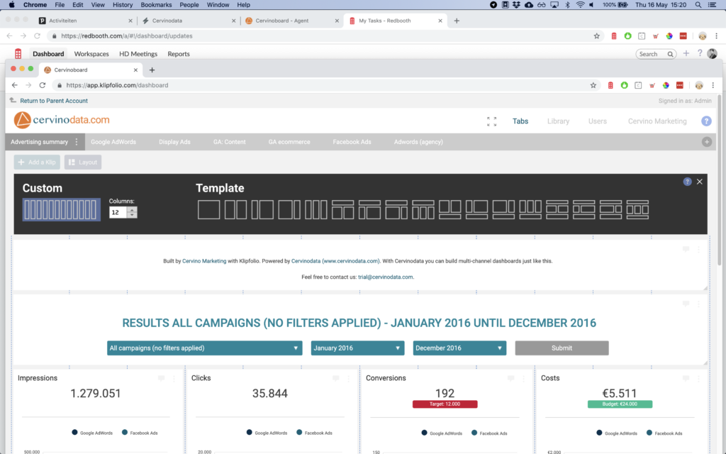
Both Data Studio and Klipfolio offer ways to “snap to grid”. But again, in Klipfolio this is way easier to do that. With “Lay out” it’s easy to choose from a multitude of predefined grids, but you can also simply define the number of columns you need and let the klips snap to the grid. Not just by column, Klipfolio also helps you align vertically by showing support lines (like in Powerpoint).
Klipfolio lay out options
Data Studio offers the option to define canvas size in pixels, and a grid with tiny squares to align your klips on, but these small squares make you dizzy if you look at them for a long time (i.e. when building a big dashboard). Also, there is an “align” option in Data Studio, but clicking the wrong alignment (horizontal instead of vertical, for instance) will mess up your dashboard (you can undo, of course). It works, but not as user friendly as Klipfolio.
One key thing Data Studio is missing is responsiveness. That’s bad. Klipfolio will scale seamlessly from a desktop size to a TV screen size and tablet size and back. Data Studio will force you to zoom in manually. If your client has to adjust the size the dashboard to the size of his screen, it does not leave a great impression. Especially when he / she sees the report for the first time.
4. TV screen mode
It is possible to show a Data Studio dashboard on a TV screen but showing multiple pages in a carousel is not an easy thing to set up. I am pretty sure it is possible, but after some looking around in Data Studio and searching online, I did not find what I needed. In Klipfolio, you can just click the Full screen (TV) Mode and press play. You can also adjust the time each page is shown before moving to the next page.
5. Mobile app
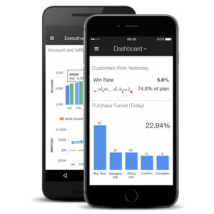
If you wish to see your performance on the go, Klipfolio offers a Mobile app version. It is possible to see a regular Klipfolio dashboard in the mobile version but Klipfolio will scale all the klips to the mobile screen. This includes the font, so your axis and metrics might get very small. Since, most of the time you just want to see one or two key numbers when en route, It is advised to create a separate dashboard for mobile use. This is easy to do and looks great.
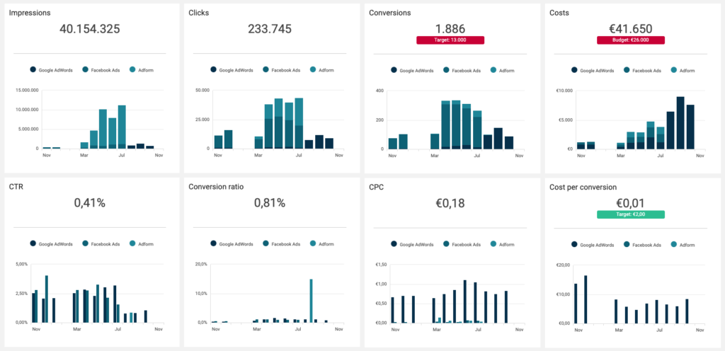
6. Indicators
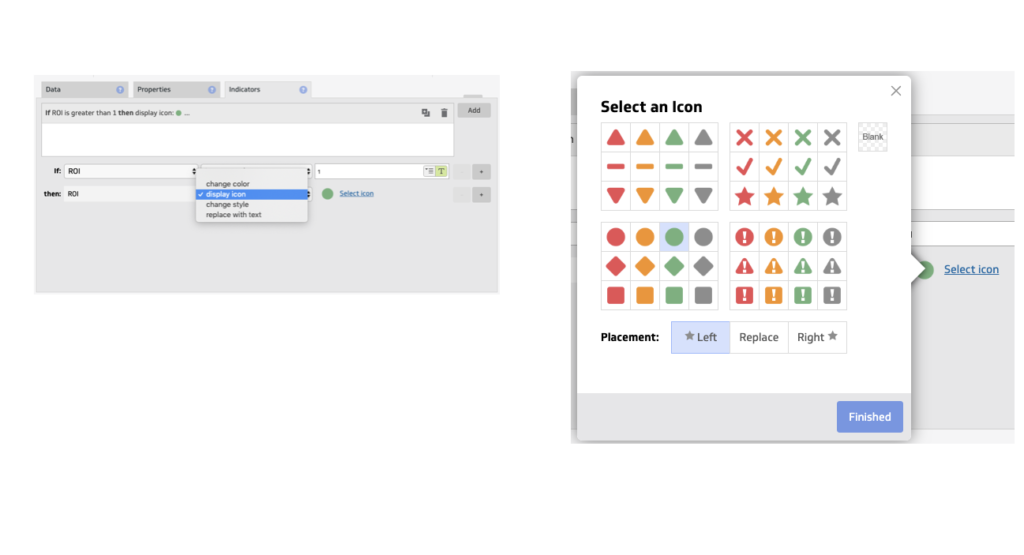
One of the key uses cases of a dashboard, on a TV screen or other format, is to highlight the key metrics that need the reader’s attention. Klipfolio offers various ways to add indicators that highlights the right data (like hitting your target or overspending you budget). Data Studio does not offer indicators.
If the out of the box indicators are not enough, In Klipfolio you can boost the look and feel of the indicators through a custom style sheet. We do this for most of our clients. How it works is beyond the scope of this blog, but we think it gives the finishing touch and makes the dashboard look even better. See the screenshot below or check out a live demo here
Klipfolio indicators
Link to live demo: https://app.klipfolio.com/published/7e5780605d8ca7d45d37150b98aa8264/multi-channel-advertising-dashboard]
7. CSS / Stylesheets
We use the stylesheet option in Klipfolio to customize the designs of most of the dashboards we deploy and maintain. What’s very handy with the CSS style sheet option in Klipfolio is that you can fully customize the design to your needs (like you would do with your website) and change the design on many places at once. For instance, if you are an online agency and have 30 clients with 70 dashboards, you can easily change your font size or color: Just change the CSS in one place and, voila, the font size or color is changed in all your dashboards.
One last cool feature of the Klipfolio CSS is that you can also change the way the headers, navigation menu, etc looks, so you can make it perfectly on par with your brand guidelines. In Data Studio it is possible to use and re-use a reporting template, but I did not manage to find an easy way to change the styling in all the dashboards at once.
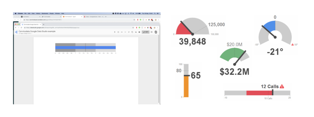
8. Types of visualization
Beyond the basic visualizations both Data Studio and Klipfolio have (like Tables, Line charts, bar charts, spreads and bullets), Klipfolio offers a few additional visualizations that we think are essential: The gauge charts and the mini charts within a table.
Data Studio offers one version of gauge charts, the bullet chart, but they are limited in customization. Klipfolio offers the same visualization, but with dynamic ranges that can change color if a threshold is reached (it works like an indicator). Klipfolio also offers the bullet chart as part of a table. This gives you the opportunity to provide more context without overwhelming your reader.
Data Studio vs Klipfolio gauge charts
Deploy and manage dashboards at scale
9. API connection for scalable deployment & management
For more advanced users and larger organizations with development capacity, the Klipfolio API is very powerful. It allows you to basically change every element in Klipfolio, automated. This ranges from copy/pasting a dashboard into another client and replacing the content of a data source with the right data, to changing the access for many users at once.
In Klipfolio you can even automatically replace a complete set of dashboards with a newer version. For instance, if you decide you want to add the data of the previous period to a couple of graphs, but you have 30 clients and 70 dashboards you would go nuts if you had to do this one-by-one. With the Klipfolio API you can just copy/past. Done.
10. SSO, domain aliasing, etc.
Both Data Studio and Klipfolio offer ways to embed a dashboard. But again, Klipfolio is way more advanced. With SSO (Single Sign On), you can for instance give access to dashboards that are seamlessly integrated within other platforms. Users get to see only what they need to see, depending on their rights in Klipfolio, so no need to create duplicates.
Another nice feature is domain aliasing. Klipfolio allows you to create your own url (like dashboard.yourcompany.com ) to give your users or clients a better brand experience (see also CSS).
Conclusion
We definitely need and use all of the 10 things and not just because we set a high standard of design quality for our dashboards. In terms of telling your data story, Klipfolio just has more to offer. We occasionally do custom building of dashboards in Data Studio, but as soon as we need more than just the basics, Klipfolio is our preferred dashboarding solution.
And to help our clients (mostly agencies) to deliver custom design, professional and easy to interpret dashboards at scale, we wouldn’t know where to begin without the API power Klipfolio offers. Looking at the pace of change (Google Data Studio vs Klipfolio), I am pretty sure we will not change our minds any time soon.
Note
This article has been written with the support of Klipfolio and has also been published on the Klipfolio website in a slightly adjusted form, check it out here